Unveiling our New Logo: A Fresh New Look
A few years on from celebrating our 25th year of supporting the NHS with benchmarking services, it’s time for a change. We’re pleased to share the refreshed, but still recognisable emblem!
In 2021, we celebrated our 25th year of being a trusted partner of the NHS, providing the in-house benchmarking service to our national membership. This warranted the addition of a silver surround to our logo! But, it’s been two years since, and to keep current, accurate and relevant, we are refreshing the branding to align with our recently updated Values.
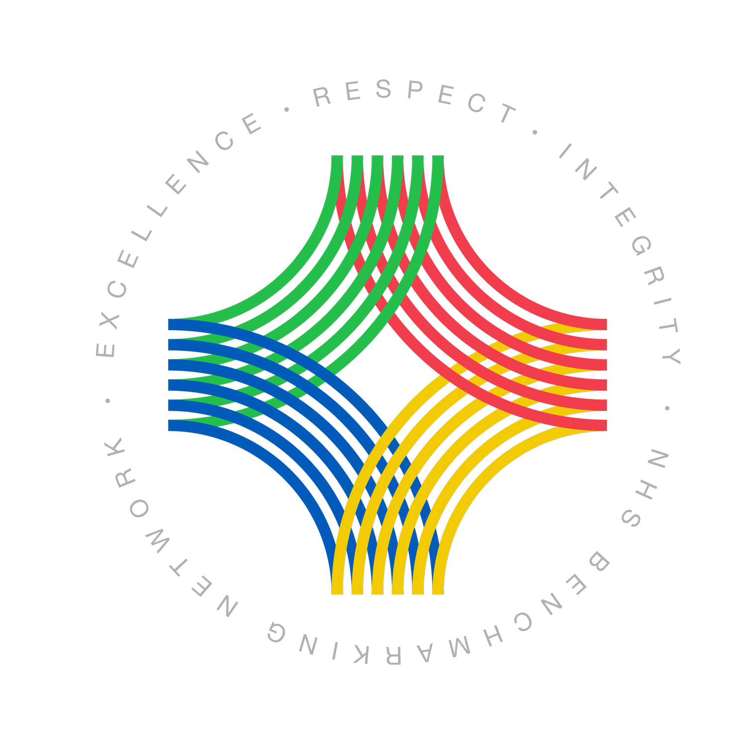
The circular quadrant is well-established and highly recognised within the field of healthcare analytics and service improvement. We have worked hard to embed awareness of the Network into your working practices and executive discussions, so the quadrant emblem has been simultaneously and considerately retained and modernised.
The subtle difference comes with the illustration of the colour wheel, representing the four sectors we benchmark (Acute, Community, Mental Health, and ICS (previously Commissioning)). These have been brought up to date with clean lines to match the colour wave design introduced last year. In addition, our Values (Excellence, Respect, Integrity) have been assimilated into the logo, a welcomed suggestion guided by our Steering Group. Now an integral part of our logo and a clear reminder of what we stand for daily.
You may notice a few changes over the coming weeks as we bring the logo into effect, but this won’t impact you and the outputs or service you receive. Throughout April, we will be updating our website and the members’ area, bringing our reports and outputs in line with the new branding, and changing our social media platforms too. It’s a big job behind the scenes, but an important development to align our imagery with our values. We hope you like the new look!

